Thursday, December 10, 2009
Cool Careers – Graphic Design
This video clip is about Jeremiah Desmarais who is a young graphic designer who owns and operates a design house called Extremely Graphic Associates. This is a Montreal based advertising agency specializing in fresh and unique concepts.
His view is that study doesn’t teach you how to run a business. You set it up yourself and learn as you go. He goes on to say that the graphic industry is a very fast moving industry and there are always new trends and you have to always stay on top of it.
Jeremiah Desmarais first started off by doing a basic course called pre press, which is the industry of printing graphic ideas on to the final printed page. He also says that the initial stage is to acquire a client base and that is done by going out and being aggressive. He got his clients by visiting stores after school and telling people about what he does and offers them his services. He currently posses around 30 regular clients on an on going basis and majority of his work comes to his company by simply word of mouth.
Jeremiah Desmarais has a philosophy that he lives by personally as well as he applies it to his business. The philosophy is called “C. A. N. I.” which stands for constant and never ending improvement. He believes that if people can commit themselves to something everyday and try and increase how good they are at it by 1%, by the end of the year they would have achieved a massive change.
To stand out in the market today he says you have to be unique and different. You have to know when to push the limit as well as know what your boundaries are. He believes that his youth is an advantage in many situations. He finds creativity and fun in what he does and I personally think that is very important for any sort of designer. Love what you do and do what you love and you’ll never have to work another day in you life.
Monday, November 30, 2009
Monash Art & Design Graduand Show 2009
The creative works of more than 250 final year Design and Fine Arts undergraduate and honours students from Monash University's Faculty of Art and Design will feature in the annual Graduand Student Exhibition, which will be launched this Friday 20 November 2009.
Work includes interior architecture (interior design), industrial design (product design), visual communication (graphic design), multimedia and digital arts, sculpture, painting, ceramics, photomedia, printmedia and glass.
My favourite piece of work was from the industrial design secion. It was basically a air purifying system which was quite simple and effective. It was decorative at the same time. It was a maze which let a plant run through it. This design won the Ivetech Award for Best Product Design (Industrial Design).

Anothr piece of work i found very interesting and eye catching was Amber Harris's “E=mc2”.

10 Populat Australian Logos
.jpg)

1. GM Holden Ltd is an Australian automaker based in Port Melbourne, Victoria. The company was founded in 1856 as a saddlery business, but later moved into the automotive field, becoming a subsidiary of General Motors (GM) in 1931. Holden has taken charge of vehicle operations for GM in Australasia and, on behalf of GM, holds partial ownership of GM Daewoo in South Korea. Over the years, Holden has offered a broad range of locally produced vehicles, supplemented by imported GM models. In the past, Holden has offered badge engineered Chevrolet, Isuzu, Nissan, Suzuki, Toyota, and Vauxhall Motors models in sharing arrangements, with Daewoo, Opel and Isuzu-sourced models sold currently.
2. Woolworths is the largest supermarket chain in Australia, owned by Woolworths Limited. It is colloquially known as "Woolies" and in Victoria the majority of stores trade as Safeway.
3. The Commonwealth Bank of Australia is the largest bank by market capitalisation in Australia, with businesses across New Zealand,Fiji, Asia, USA and the United Kingdom. Commonwealth Bank provides a variety of financial services including retail, business and institutional banking, funds management, superannuation, insurance, investment and broking services. Commonly referred to as the Commonwealth Bank (or Commbank), The Commonwealth Bank is now the second largest Australian listed company on the Australian Securities Exchange as of January 2008 with brands including BankWest, Colonial First State Investments Limited, ASB Bank (New Zealand), Commonwealth Securities Limited (CommSec)and Commonwealth Insurance Limited (CommInsure). On 7 December 2007 the bank won its skirmish with ANZ over bragging rights to the title of "Australia's most convenient bank".
4. Qantas Airways Limited is the national airline of Australia. The name was originally "QANTAS", an acronym for "Queensland and Northern Territory Aerial Services". Nicknamed "The Flying Kangaroo", the airline is based in Sydney, with its main hub at Sydney Airport. It is Australia's largest airline and is the world's second oldest airline. Qantas is headquartered in the Qantas Centre in the Mascot suburb of the City of Botany Bay, Sydney, New South Wales.
5. Organisation promoting the use of a standard logo to distinguish products where a prescribed percentage of production has occurred within Australia.
6. Cricket Australia, formerly known as the Australian Cricket Board, is the governing body for professional and amateur cricket in Australia. It was originally formed in 1905 as the Australian Board of Control for International Cricket. It is incorporated as an Australian Public Company, limited by guarantee.
Cricket Australia operates all of the Australian national representative cricket sides, including the Australian cricket team, the Australia national women's cricket team and youth sides as well. CA is also responsible for organising and hosting Test tours and One Day Internationals with other nations, and scheduling the home international fixtures.
7. Tourism Australia is a statutory authority of the Government of Australia, with responsibility for tourism marketing within Australia and internationally, as well as research and forecasting of domestic and global tourism trends.
The organisation was formed on 1 July 2004, under the Tourism Australia Act 2004, and merging four previous organisations: the Australian Tourism Commission, See Australia, the Bureau of Tourism Research and the Tourism Forecasting Council.
8. The Australian Football League (AFL) is the major professional Australian national competition in the sport of Australian football and is arguably Australia's biggest sporting competition in terms of membership, corporate sponsorship and attendances (ranked 4th in the world for average attendances.
The league comprises 16 teams which play 22 home and away rounds between late March and late August or early September. This is followed by a four-week finals series which culminates in two teams playing off for the Premiership, in the Grand Final.
9. The National Rugby League (NRL) is the top league of professional rugby league football clubs in Australasia. The NRL's main competition, which is called as the Telstra Premiership due to sponsorship reasons, is contested by sixteen teams, fifteen of which are based in Australia with one based in New Zealand. It is the Southern Hemisphere's elite rugby league championship and the most attended rugby football competition in the world.
10. Telstra or Telstra Corporation Ltd is an Australian telecommunications and media company, formerly owned by the Australian government. Telstra is the largest provider of both local and long distance telephone services, mobile services, dialup, wireless, DSL and cable internet access in Australia. Telstra is based in Melbourne, Victoria, Australia.
Formerly Telecom Australia, the company was renamed in 1993 under the Telstra brand. It was privatised in stages between 1997 and 2006. Telstra's headquarters are located at the Telstra Corporate Centre in Melbourne, Australia.
Wednesday, November 25, 2009
Transformations

Transformations was a exhibition held from the 12th of November to the 18th of November at the J space centre for contemporary arts at Chisholm Institute of Tafe Dangenong. The exhibition was held by the graduate students from the certificate IV interactive digital media course. The exhibition featured the works of Mireille Beaufremez, Benjamin Chan, Oslyn Franks, Michael Mavracic, Yvonne Picot, Sylvia Riley - King, Leanne Roberts, Quan – Hung Truong and Annie Watkins.
I found most of the work was computer based. However, quite a few works were done using manual techniques. Some of the work had a 3D element to it as well.
My favourite piece of work would have to be ‘Interior No 1’ by Michael Mavracic. I personally thought the detail in the work was amazing and the whole feel of the piece just grabbed my attention.
Another piece that I really liked was titled ‘Protection’ by Benjamin Chan. The piece had a lot of emotion to it. It showed a person covered in cloth and afraid.
Another interesting piece of work was ‘Paris’ by Sylvia Riley-King. I liked the whole text element that was added to it. It gave the work an added bit of interest and the combination of both the visuals and text really worked.
‘Evolution Highway’ by Annie Watkins was a really good piece of art that had been produced digitally. It won the Best Digital Painting & Drawing Award.
"The proper artistic response to digital technology is to embrace it as a new window on everything that's eternally human, and to use it with passion, wisdom, fearlessness and joy" - Ralph Lombreglia
Thursday, October 29, 2009
The Offering By Robbie Rowlands

Robbie Rowlands is an Australian visual artist who is interested in sculptural work. He bases his work on things that exist at the fringes of our awareness, utilitarian objects such as lampposts, desks, chairs and rundown buildings and houses.
He graduated from The Victorian College of the Arts in 1999. Part of this study was based at Pratt Institute, New York after, his first solo exhibition found came out of this work. His work looks closely at the everyday objects around us, he questions their nature, their stability. Working both familiar and found materials, Rowlands cuts into and manipulates the recognisable, peeling back one form to reveal another, reflecting upon the passage of time and what lies beneath the surface of our familiar world.
The Offering is bases on a 105-year-old church that was scheduled to be demolished. The church was in the process of been taken apart when Robbie Rowlands obtained permission to use it to create his form of art. The church was not always this ragged looking. It was once a site for worship and community gathering. Rowland allowed the building to show what it still had to offer as a site for exploring themes of memory and history, revelling the formal and aesthetic potential contained within the building itself.
The challenge he faced was to evoke the rich history of the building and single its fate within the context of artistic practice. Robbie Rowlands cut into the walls and floor, peeling and stripping back the buildings basic materials in a process to create his art. The sculptural forms created are aesthetically rich, and the use of materials derived from the essence of the building offer a tribute of some kind by making us newly aware of the buildings past splendid beauty.
All in all, Robbie Rowlands truly demonstrates that art can be of many forms.
Wednesday, September 23, 2009
Arthur Ganson – Sculpture that’s truly moving
Arthur Ganson is a renowned kinetic sculptor. Ganson makes mechanical art demonstrations and Rube Goldberg machines with existential themes. Ganson was born in Hartford, Connecticut in 1955. He received a Bachelor of Fine Arts degree from the University of New Hampshire in 1978.
Arthur’s work has a lot to do with happiness. He started out as a young boy making things for people as a way of showing love. When he was a child he started to explore motion as he loved the way things moved. He started out by making little flip books. In college he found himself making fairly complicated and fragile machines and this really came about from having many different kinds of interests. In high school he was interested in programming computers and later on was interested in becoming a sorgeon as it ment working with his hands in a very focused and intense way. So he started taking courses which helped him create art and making them very precise with his hands and coming up with different kinds of logical flows of energy through a system and also working with wire made everything that he did both visual and a mechanical engineering decision at the same time.
My favourite design of his was the wish bone that was made to walk across the table. He engineered basically constructed a mechanical solution to just make a wish bone walk across a table. He says this reminds him of a cowboy who was sitting on his horse for too long. I found that quite humorous. He describes this sort of work as pupetry where his the puppeteer and he control and designs the objects.
Im my opinion his work doesn’t really mean anything, but all his work is just simply inspired by movement. In a nutshell, Arthur Ganson loves solving mechanical problems.
Theo Jansen: The art of creating creatures
Theo Jansen (born March 14, 1948, in The Hague, Netherlands) is a Dutch artist and kinetic sculptor. He builds large works which resemble skeletons of animals and are able to walk using the wind on the beaches of the Netherlands. His animated works are a fusion of art and engineering; in a car company television commercial Jansen says: "The walls between art and engineering exist only in our minds."
Theo talks about a project he started 16 years ago and its about making new forms of life. These forms of life are made using plastic tubes. These creatures are mainly powered by the wind. He explains the propotion of the tubes in each animal is very important for walking. There are 11 numbers which are called the eleven holding numbers. These are the distances of the tubes which make it walk the way it does. Infact it’s a new invention of a wheel. The axis of a wheel stays on the same level just like the hip of the creature does. He says it’s a better method than a wheel and explains if you try to ride a bicycle on the beach, its not very easy to do. But this new method makes movement easier as the feet of the animal just steps over the stand and need not touch every bit of the ground in between like a wheel does. So basically, 5000 years after the invention of the wheel, he says, we have a new form of the wheel.
Each animal is made to detect all the dangers on the beach. And one of the biggest is the sea. Thus, each animal is equipped with a water feeler. This is basically a tube that normally sucks in air. But when it detects and swallows water it feels the resistance of it, therefore, causing the animal to move away from the water. The animal is also equipped with a brain. This is a binary step counter. The purpose of this is to let the animal know where exactly it is on the beach at all times. There is also a nose attached to the creature. This helps to stabilize the animal during a storm or harsh winds. A hammer sort of device hits the nose which is a sort of pin that is driven into the ground helping the animal fixate itself to the ground.
Monday, September 21, 2009
Stefan Sagmeister: Yes, design can make you happy
Stefan Sagmeister (born 1962 in Bregenz, Austria) is a New York-based graphic designer and typographer currently living in Bali, Indonesia[1]. He has his own design firm, Sagmeister Inc in New York City. He has designed album covers for Lou Reed, OK Go, The Rolling Stones, David Byrne, Aerosmith and Pat Metheny. Sagmeister studied graphic design at the University of Applied Arts Vienna. He later received a Fulbright scholarship to study at the Pratt Institute in New York. He began his design career at the age of 15 at "Alphorn", an Austrian Youth magazine, which is named after the traditional Alpine musical instrument
In the video Stefan talks about moments of happiness he has had in his life and goes on to say how many of these moments had to do with design. He first talks about how he went to visit a friend in Hong Kong around 15 years ago, and at the time been a very supersticious person, upon landing at the airport he thought if he seems something good he would have a great time during his stay and if he saw something negative he would be miserable. And as he landed the first thing he noticed was a billboard with the word ‘winner’ on it. After leaving Honk Kong with a great job offer and returning to Austria, he packed his bags and another week later, still supersticious, he flew back to Honk Kong. On his way there he was thinking if the ‘winner’ billboard is still up he would have a good time and if its gone he would have a miserable time. It turned out that not only was the billboard still up, there was another one placed next to it saying ‘double-happiness. However, he had a terrible time there.
He also talks about how he went to Tokyo to visit a new museum. The innaugral exhibit was called happiness and under that theme the exhibition was sectioned into 4 sections. Arcadia, Nirvana, Desire and Harmony. Each section was different and unique. What he took away from the exhibition was that most of the pieces in their was about the visulization of happiness and not about happiness. He says that he felt a little bit cheated as the visualization is a easy thing to do and his studio does that sort of thing all the time.
All in all the Stefan goes on to mention and show many other visuals of design that was trully creative and no doubt depicts happiness through them.
Wednesday, September 16, 2009
Kareem Rizk

Kareem Rizk had a glamorous view of what design was supposed to look like and had always wanted to work in a big studio. Qualified as a graphic designer from university he applied for many jobs and had several interviews. He did not however sell himself very well but finally did manage to secure a job at the Herald Sun. After working there for awhile he decided to start doing his own work as an artist and started venturing into doing collage work which he says he enjoys doing more than anything else. He first produced a large body of work in 2006 and slowly started shifting into doing this sort of work more. He is know recognized in been one of the best collage artist going around today.
He describes that collage work is always structural and he always works to a grid in his mind. He hardly ever relies on accidents. To produce these artistic pieces he uses torn paper, oil pastels, carbon paper and random images just to mention a few. The images he uses are generally over sixty years old, thus eliminating any copy right issues that may arise. But he takes further precautions by manipulating the images in various ways such as covering the faces with type and other images. He sources his images from old publications and never uses images of celebrities and of any publication after the 1980s. He never uses newspapers either as he explains that it doesn’t help him to establish his own unique style.
He started his work on paper as a background and decided moving onto using canvases so it helps his display them in galleries around the world. His work consists of mainly paper, cardboard and canvas. He also stains the paper for a more creative olden looking background. He will be featured at the Art Basel 2009 which is to be held in Miami Beach.
He also produces digital pieces using old paper, textures, typography, old images and transparencies. By the use of Photoshop he is able to create various textures and colours as well. He released his website in 2006 which helped his become known and established as a collage artist around the world. The website took him over three months to create since he wanted it to be a very visual site. He did a lot of self promotion and pushed his work anywhere he could to gain as much publicity as possible. This helped him in getting where he is today.
He names his work after something in the collage itself. Keeps it very simple. But at times some pieces can have quite complicated names. He says he loves using black and white images and puts in coloured backgrounds. He goes on to say that this helps the composition sit better. He sometimes designs his work digitally before proceeding to create on canvas.
He is since lately looking into having his work printed on t-shirts, mugs and shoes. He says that some of his greatest influences are artist such as Richard Hamilton, Charles Walkin, Mario Wagner and Edurado Recife. Recife was his main influence to get into collage work he added.
Australian Colour

Based in Melbourne since 2001, Louis Porter is a creative and talented photographer who was born in England in 1977. His work has been exhibited in Australia, England , Canada and Austria. Since his arrival in Australia, he has traveled suburbs of greater Melbourne for new, the interesting and the strange photos he can capture. He carries his camera with him almost everywhere he goes and if the opportunity for capturing a good picture presented itself, he would be ready to capture it without any hesitation.
His photography is categorized as street photography. He has traveled from Altona to Hoppers Crossing and Deer Park to Thornbury. His Exhibition ‘Australian Colour’ presents a series of ink jet prints individually titled after the places they were shot at. Rather than staging a scene like many photographers do, Louis Porter finds his subject matter while exploring the streets. His shots are all done with film rather than using a digital camera. He explains that the film helps his capture a better colour quality that he loves in his photography. The film he uses is extremely sensitive to strong colour which helps him in the process as well. None of his images are digitally manipulated and the colour captured is in the photograph itself.
Louis Porter’s main aim in taking photographs is to capture the colour, thus most of his images are captures before afternoon and never at night. However, when asked if he would be interested in night photography, he responded that he would be looking into that aspect as well in the near future. His attitude to street photography is truly unique since most street photography out there is focused mainly on people and buildings rather than on colour itself.
Porter has described these works as “portraying familiar scenes that just
aren’t right”.
Saturday, August 29, 2009
From East to West – Liu Xiao Xian
The exhibition titled ‘From East to West’ by designer artist Liu Xiao Xian was held recently at the RMIT Gallery. Liu Xiao Xian came across to Australia as a refugee over 19 years ago in the wake of the Tiananmen Square massacre. This was Liu Xiao Xian’s first major solo exhibition.
One look at Liu Xiao Xian’s designs and it is evident that his work is about the western world meeting eastern cultures, Chinese culture to be precise. However, his work is not as straight forward as you would like it to be. It takes a bit of time to see where and which angle his coming from.

My favourite piece of work of his was ‘Our Gods’, which was basically two very large images of Jesus Christ and Lord Buddha. Each one of these images was made up of hundreds of small scale images of the same large image. It’s impossible to comprehend the talent and work Liu Xiao Xian put into creating that piece of art. There were two small sculptures of these two images as well. They were precisely crafted out of porcelain that was over glazed with gold and under glazed with copper. When taking a closer look at these two Gods, it is clear that Liu Xiao Xian portrays many differences in them. It shows the difference between the western God from the eastern God. It shows happiness and sadness. While Jesus Christ is shown with a crown of thorns, Lord Buddha is portrayed smiling or laughing. It also shows that one is a religion and one is a philosophy.


Another piece of art I found very interesting was the two very large sculptures that was placed on display in front of a bright red background. Not too sure of the symbolism of the background colour. My understanding of these sculptures was the difference between western medicine and eastern medicine. He shows how the eastern world uses a more natural approach to medical treatment. The holes in the eastern woman symbolizes the use of acupuncture as a pain reliever as appose to using western medicine. It is hard to say what Liu Xiao Xian tries to tell you when it comes to the stance of the two figures though.

Another amazing piece of work was the very large eye catching and dominating ‘reincarnation portrait’ that greeted you as you walked into the exhibition hall. This was titled ‘Reincarnation – Mao, Buddha and I’. This was made up of 300 panels of C-type photographic prints, each 300 x 200cm in size.
There were many portraits on display showing a Chinese family sitting in the foreground of a picture that is been taken in the western world. There was a Chinese backdrop held up when these pictures were taken. What I gathered from this, and I think what Liu Xiao Xian is trying to say through these pictures is that, no matter where in the world you choose to live, you will always take a piece of your past, culture and simply a piece of home with you.


 Trying to look intellectual...
 ...and failing miserably!!!
The Great Wall of China was another work of art that caught my attention. Liu Xiao Xian took a series of photographs of plates outside an abandoned plate factory in southern China. Inspiration for the creation of the Great Wall of China was drawn from Jingdezhen in Jiangxi province, the home of porcelain production. To create this piece he systematically photographed every inch of the dumped plates using a process he describes as manual scanning. With the aid of Photoshop he assembled the 500 odd images to recreate the scene that he originally came across.
All in all this exhibition was a amazing look into the mind, thoughts and life of an amazing designer.
Interview with Fernando and Humberto Campana
This is an interview with popular brothers, Fernando & Humberto Campana which took place at Design Miami 2008 on the 2nd of December 2008 at Miami Beach Florida. Fernando talk about Design in today’s world. They talk about what they believe in as designers and how design brings about another aspect and it is not just about function and form. They talk about how design is a fantasy and emotion. They also go on to say that people today need much more connections between them and the pieces they are going to decorate their houses and homes with.
A question was put forward to them stating that design need to have a form and function. Their response to that was that design goes beyond form and function and both of these two elements form a kind of poetry.
When asked whether they think about the global financial crisis, environmental problems, energy crisis, global warming when designing the arts and products, they responded by saying, scarcity is their treasure. They also go on to say that when living in Brazil where there is no tradition in design, they started out under very difficult conditions. They didn’t even have money to invest in the tools they required to do their work. So they started looking around for what they could use as alternates. For example they wanted to produce a plastic chair and as they didn’t have the resources to do so, they started using bubble wrap to produce the chair. They go on to say that even though it was difficult things worked out in their favour.
When asked if its good for creativity when there is not a lot of raw materials for a designer, they responded by saying from a crisis you grow up. They say people will rethink their lives and start to realize what is necessary.
They say through the hardship they go through with the economic crisis in Brazil, it makes them mentally stronger and flexible in terms of changing and adapting.
When asked what makes a good design. They reply, the design that touches the peoples souls by the functionality, by the poetry, by the price or by anything that can capture the heart and soul of the people.
In conclusion, I think this was a very insightful look into the creative minds of two incredibly talented modern day designers.
VAN GOGH: Brush with Genius
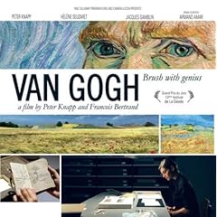
Vincent Van Gogh is one of history’s most influential artists and is probably one of the main contributors of today’s modern art. He is by far the most popular and the most spectacular painter the world has ever known. Van Gogh was born in Zundert, Neatherlands on the 30th of March 1853.
Brush with Genius is based on the life and death of Vincent Van Gogh. The short film is centered around the narration by himself and about the hundreds of letters written by him to his younger brother Theo. To better understand the artist, the film takes its views to many places. From the Van Gogh museum in Amsterdam to the south of France where he discovered his famous ‘high yellow note’. The film also takes you to Auvers-sur-Oise where he expresses his love for the country side. This is where in his own words he says “I am almost certain that these canvases illustrate what I cannot express in words, that is how healthy and heartening I find the country side”. The film is certainly a journey to the heart of Van Gogh’s paintings. The film brings you face to face with genius in its purest state.
Van Gogh lived most of his life in the Neatherlands till he moved to France and lived with his brother till he decided to take his own life the the fields where he loved to paint. He shot himself in the chest and is known to have died 2 days later. He died at the age of 37. His brother who was by his side during Van Gogh’s last moments died 6 months later as he could not come to terms with the loss of his beloved brother.
He is known to have created over 800 paintings in the 1880s alone.
He was a man who lived most of his life in pain and suffered sevier depression, specially during the last few years of his life. His mental state was such that it drove him to the point of cutting one of his earlobes off. He commited himself to a mental clinic where he lived a year of his short life. Within that year he is known to have kept on painting as a passion and at the same time at part of his therapy.
Van Gogh says in his own words, “ sometimes the pictures came naturally to me without any effort, like in a dream”. He drew his inspiration from nature, landscapes, from the dazzling yellow of the cornfields to the deep blue of the sky.
All in all the film was a look at a painter in full creative floor. It was a journey that portraied Vincent Van Gogh’s emotions, pain and suffering. No dobut one of the greatest painters ever to place a pain brush of a canvas.
Note to David: while researching information to write this report, I came across a song that was dedicated to Vincent Van Gogh. I think the lyrics in this song says it all…
Lyrics:
Starry, starry night.
Paint your palette blue and grey,
Look out on a summer's day,
With eyes that know the darkness in my soul.
Shadows on the hills,
Sketch the trees and the daffodils,
Catch the breeze and the winter chills,
In colors on the snowy linen land.
Now I understand what you tried to say to me,
How you suffered for your sanity,
How you tried to set them free.
They would not listen, they did not know how.
Perhaps they'll listen now.
Starry, starry night.
Flaming flowers that brightly blaze,
Swirling clouds in violet haze,
Reflect in Vincent's eyes of china blue.
Colors changing hue, morning field of amber grain,
Weathered faces lined in pain,
Are soothed beneath the artist's loving hand.
Now I understand what you tried to say to me,
How you suffered for your sanity,
How you tried to set them free.
They would not listen, they did not know how.
Perhaps they'll listen now.
For they could not love you,
But still your love was true.
And when no hope was left in sight
On that starry, starry night,
You took your life, as lovers often do.
But I could have told you, Vincent,
This world was never meant for one
As beautiful as you.
Starry, starry night.
Portraits hung in empty halls,
Frameless head on nameless walls,
With eyes that watch the world and can't forget.
Like the strangers that you've met,
The ragged men in the ragged clothes,
The silver thorn of bloody rose,
Lie crushed and broken on the virgin snow.
Now I think I know what you tried to say to me,
How you suffered for your sanity,
How you tried to set them free.
They would not listen, they're not listening still.
Perhaps they never will...
Wednesday, August 26, 2009
Campana Brothers at Vitra Design Museum
The video is about an exhibition of the work of brothers Fernando and Humberto Campana which was held at the Vitra Design Museum in May 2009. The exhibition showcases pieces from the latest to the very early beginning of their career even before their collaboration as designers.
Fernando Campana was trained as an architect while his brother, Humberto was trained as a lawyer, who after his studies went to northern Brazil and decided whether he should become an Indian and live like an Indian or whether he would prefer to become an artist. The object out of sea shells that was created by Humberto Campana was from the sea shells he collected from along the beaches of Brazil. Their work that spans over decades of artistic collaboration shows the spectrum of their works which rangers from jewellery to fashion to furniture and last but not least, pure artistic sculptures.
The exhibition also strived to showcase the difference between the work of Fernando Campana and that of his brothers Humberto Campana, in relation to each individual’s character and of their approach to design. As they both are very different as personalities, it is clear their choices in materials are very different too. The material is infact the subject which is in the foreground of their work. The exhibition explains the work of the two brothers as designers, through the approach and use of the materials for their designs.
Their artistic techniques, point of views and approach to their work is strongly influenced by social realism in the 1920s, cubism, pop art and even from action art. They both are influenced by different forms of art. Humberto is much more influenced towards sculptured art where as Fernando is more influenced towards a more conceptual approach to art and design.
The functionality of many of the objects on display is not so important than the image they portrait. The whole concept of the exhibition was to present the different approaches to art and design which were in nine different groups.
Their work method is strongly influenced by organic plants to animals, not to mention very heavily Brazilian influenced. They get plenty of inspiration from nature, from the natural jungles to the urban jungles such as the city of Rio De Janeiro.
All In all, the exhibition was a very interesting look at two unbelievably talented designers who thrive on their different approaches to art and design.
Thursday, August 20, 2009
Design Your Life - Ellen Lupton
Ellen Lupton, curator of contemporary design of the Cooper-Hewitt, National Design Museum did her first exhibition in 1993 at the age of 29 which she called Mechanical Brides and it was a show based on women, machines and technology.
Ellen Lupton along with her twin sister Julia Lupton, recently published a book called ‘Design Your Life’, which is basically a book showcasing photographs on design in ones everyday life. The book started out of a website called designyourlife.org, which was created by Ellen and Julia 5 years ago. The website was basically a place where they would complain about objects that would annoy them and would comment on trends and developments of their interests.
I find Ellen brings out an important point when she refers to the toaster, kitchen computer or the refrigerator. She basically goes on to say that once a great design for a contemporary product has been created and successfully marketed, designers will find some other way to better that particular product as well as re-construct the product to give it a multifunctional purpose. In her view it could mess up the product and take away the purpose the product was originally created for. However Ellen finds in some cases that the reconstructed product can also be better for the consumer when it comes to elements such as price, quantity, wastage, speed, etc. A good example of this is the square role of toilet paper she talks about which discourages wastage, thus becoming cost effective.
In my opinion, I think what Ellen is trying to get across is that keeping a design simple and direct to the point is most often the best way to go about a design situation. Certain products, when so-called improvements are made to them, raise the cost of the product, and that could deter consumers from purchasing them.
Ellen goes on to talk about the Visibility Principle. It’s my understanding that the basic idea behind this principle is that if the work or design is in front of you, i.e. in your face, it gets done which causes an increase in productivity.
I personally found Ellen’s take on the roller bags to be very interesting. The fact that even though the idea of putting wheels on a bag is a fantastic idea, the behaviour and mindset of the consumer using it changes. Ellen goes on to say that this is a simple case of good objects, bad behaviour.
Altogether, this was a fascinating look at a very interesting woman and author on her views on Design in the everyday world.
Subscribe to:
Posts (Atom)
